
Role: Lead Product Design (Freelance)
Project: B2B SaaS Platform / Health Regulated
Client: Clustertec / Zur Rose Schweiz via KPS
Where clarity matters.
A digital platform for managing Swiss practice pharmacies – from inventory and ordering to dispensing. Designed for a daily practice routine where safety, oversight, and efficiency are critical every day.
The ambition: building a digital ecosystem with inventory-safe processes, clear workflows, and a reduction of manual routines – so that PMAs can work reliably and stress-free.

Insights
When complexity creates pressure.
Between patient care, phone calls, and administration, there is little room for ambiguity. Yet inventory, ordering, and dispensing were long managed manually and in fragments — spread across lists, devices, and isolated systems.
Stock levels were hard to trace. Processes prone to error. Coordination time-consuming. In a regulated environment, operational complexity quickly becomes structural stress.
What was needed was not another interface, but a solution that creates order — digital, traceable, and resilient in daily use.
Three domains. One system.
The application brings together three areas that are inseparable in day-to-day practice:
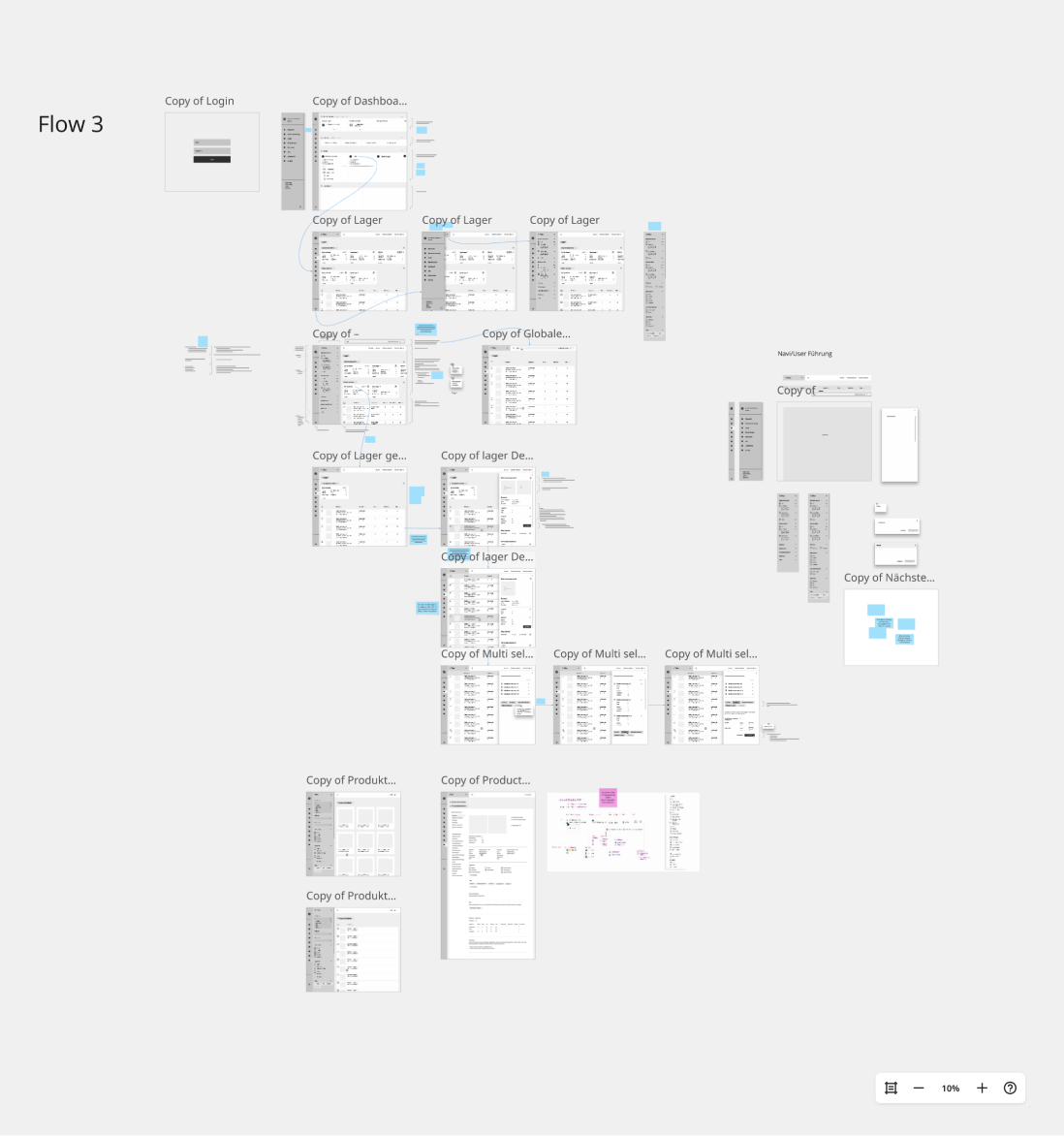
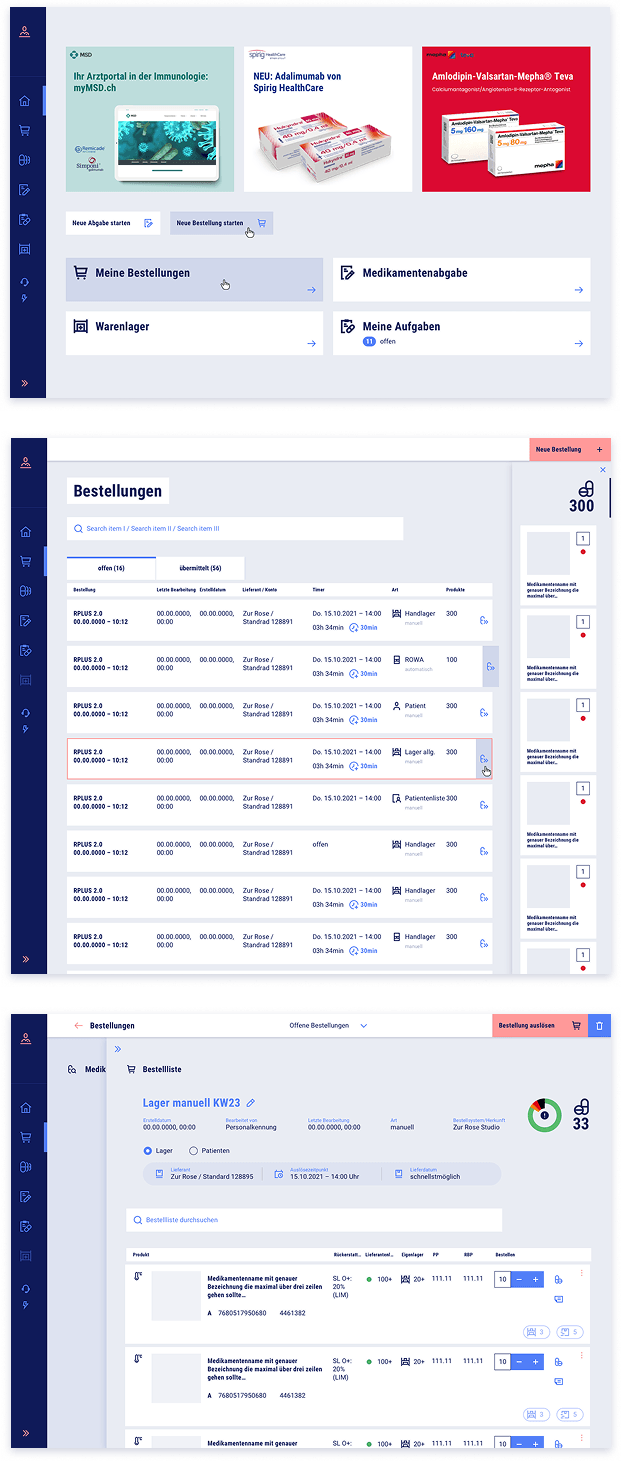
- Inventory
Traceable stock movements as the foundation for reliable audits. - Ordering
Guided ordering processes with min/max logic and controlled approval. - Dispensing
Direct linking of dispensing, prescription, and patient history.
Designed as a multi-device system, the platform supports processes where they happen: at the workstation, at the medication robot, and directly at the shelf via handheld scanner.
1/3
Timed Saved
Less administrative time in daily practice means noticeably more time for patients.
Designing from real work.
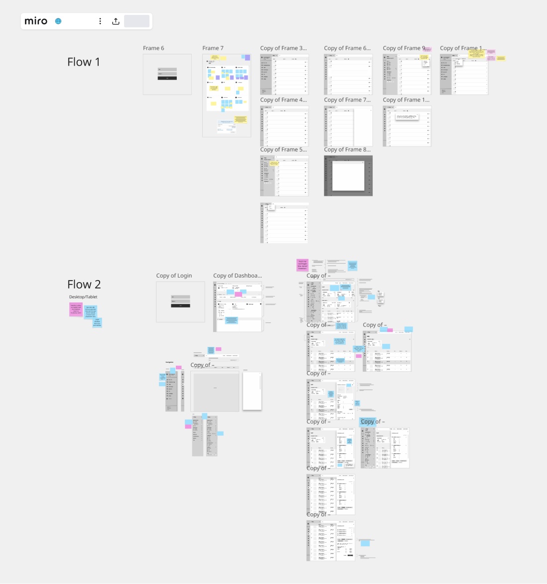
To make sound product decisions, the process began with building a deep understanding of the daily reality of medical assistants and physicians. Workflows, roles, and recurring tasks were systematically analyzed to base decisions on real needs rather than assumptions.
The insights were condensed into task maps that made dependencies, handoffs, and critical steps visible — turning complex work realities into something structured and discussable.
On this foundation, early wireframes were developed for app structure, navigation, and core flows. Through continuous co-creation, feedback was incorporated in short cycles. Assumptions were validated early, flows refined, and directional decisions grounded in evidence.
Um schnell in belastbare Produktentscheidungen zu kommen, startete die Arbeit mit einem User Research zum Praxisalltag von MPAs und Ärzt:innen. Die Ergebnisse wurden als Task Map in Miro visualisiert und anschließend in frühe Wireframes übersetzt, die als Diskussionsgrundlage für Navigation, Struktur und Kernflows dienten. Durch kontinuierliche Co-Creation mit Stakeholdern konnten Annahmen früh validiert und neue Ideen schnell bewertet werden.
more informations
- Zu Beginn wurden Arbeitsabläufe, Rollen und wiederkehrende Aufgaben von MPAs und Ärzt:innen erhoben, um reale Bedürfnisse statt Vermutungen als Grundlage zu nutzen.
- Die Erkenntnisse wurden in Miro als Task Mapping strukturiert, wodurch Abhängigkeiten, Übergaben und kritische Schritte transparent und besprechbar wurden.
- Darauf basierend entstanden Wireframes für grundlegenden App-Aufbau, Navigationsverhalten und Informationshierarchie – bewusst als erste Hypothesen, nicht als „fertiges“ Design.
- Die Wireframes wurden in Miro gemeinsam iteriert, mit Post-its kommentiert und um fehlende Anforderungen ergänzt; einzelne Flows wurden bei Bedarf neu gedacht.
- Kund:innen und Stakeholder blieben fortlaufend involviert, sodass Feedback in kurzen Schleifen einfloss und Richtungsentscheidungen früh abgesichert wurden.
Designed for everyday practice.
1 YEAR
after the first line of code, the MVP goes live — ready for the first 5 pilot customers.

From exploration to decision.

Exploring the system
Simplified representations to make flows and system behavior visible quickly. They help test assumptions early, focus discussions, and efficiently narrow down possible directions.

Refining the details
Selectively applied, reduced high-fidelity components to clarify critical details. The focus is on relevant elements and interactions — deliberately without fully designing complete screens, to enable precise decisions and maintain efficiency.
DESIGNED
TO SCALE
TO SCALE
A clear visual system.

A dedicated design system was developed for the platform — built for daily use by medical assistants and physicians.
It structures complex information clearly and reduces visual friction. Color, typography, and UI elements create orientation and carry high information density without overwhelming. The look and feel supports focused work over extended periods — consistent, functional, and reliable.
Designed for desktop, ROWA control screen, and handheld scanner, it delivers a unified experience across all devices.
A shared direction.
The Design Compass translates abstract requirements and expectations into clear, evaluable guardrails.
It creates a shared understanding of what the product should stand for — visually and conceptually.
Core attributes were defined, prioritized, and put in relation to one another together. This produced clear criteria that align design decisions across all functionalities and features — independent of personal taste.

Making consequences visible.


Based on the Design Compass, several deliberately reduced design routes were developed, each interpreting and weighing core dimensions differently.
Rather than presenting a single design, visual consequences were made comparable. This allowed for a realistic assessment of which design principles and UI elements could genuinely support the functional and content complexity of the application over the long term.
Consistency in practice.
Reusable patterns, predictable behavior.
Knowledge that doesn’t walk out the door.
By building a central component library with clear guidelines, UI standards were made accessible to everyone. This reduces coordination effort, prevents one-off solutions, and increases consistency across design and implementation.
Team members and stakeholders can resolve questions self-service and build knowledge independently. At the same time, a shared understanding of rules, states, and component usage is established — with the effect: faster implementation, less rework, and a sustainable knowledge base that is not dependent on any individual.

From rules to real screens.

From platform to product.
After around three years of continuous development, the platform was rolled out as a white-label solution and is today in use, among others, as Zur Rose Studio.
The interactive click dummy allows you to experience core workflows and design decisions firsthand.
